Lab 4 - Size Classes
Auto layout is used to make adjustments to a layout based on constraints. At times a layout requires more significant adjustments based on the device type, screen size or orientation.
- A bigger font size in the larger iPad Pro screen than on the smaller iPhone screen.
- A view to be laid out differently on iPhones when in landscape or portrait mode.
- To provide additional buttons in the iPad version of your app.
- To layout content differently when your app is in slide over or split view modes.
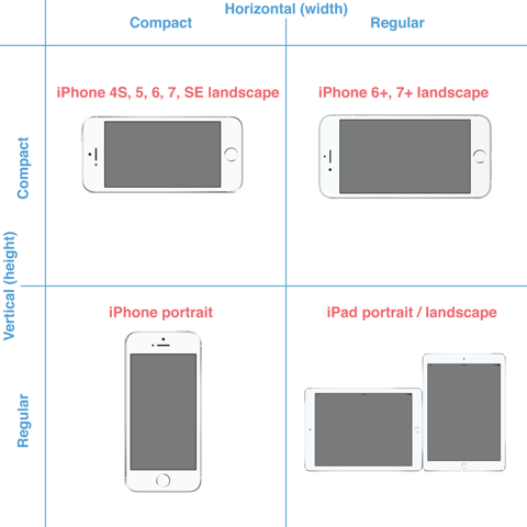
In defining the size classes, Apple made some interesting decisions:
- When in landscape orientation, iPhones (other than 6+ and 6S+) are still considered to have compact widths.
- All iPads in portrait or landscape mode, are considered to have both regular widths and heights. This means that a change in orientation on an iPad does not trigger a change in size class.
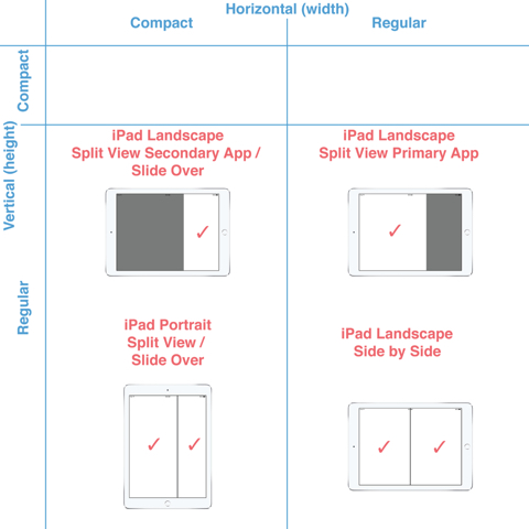
Size classes are not an alternative to constraints and auto layout, rather they work in tandem. You can make many changes to a layout with size classes, such as:
- Views can be resized or repositioned.
- Fonts and colours can be changed.
- Constraints can be activated or deactivated (called installed and uninstalled).
- Views can be added or removed (also called installed and uninstalled).
Vary by Trait
We will start by creating a simple UI that contains a title label and a text view that occupies the rest of the available area. We will then apply size classes and adapt the UI to assign different font size for regular width and height devices. We will also add an additional Sub Title label to the UI that will be displayed only for iPad’s by making use of variation for traits.
Create the interface as shows in the screen capture below. It just uses a Label with text Title and a Text View that fills the rest of the available screen space. Select the title label and in the attributes inspector add a font attribute for regular width and height. Make the font 55 points for regular width and height.
Similarly for the text view set the font size to 35 for regular width and height. Run the application on different device types using the simulator and verify that the fonts are used as specified by the size classes.
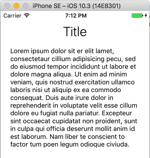
We will now modify the display for iPad’s by adding an additional label with text “Sub Title” (see screen capture below). This label will be displayed only for iPad devices, and not be displayed for iPhone type devices.
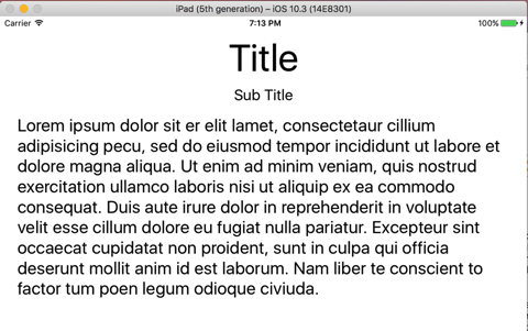
Create the interface as shows in the screen capture below. It just uses a Label with text Title and a Text View that fills the rest of the available screen space. Select the title label and in the attributes inspector add a font attribute for regular width and height. Make the font 55 points for regular width and height.
Similarly for the text view set the font size to 35 for regular width and height. Run the application on different device types using the simulator and verify that the fonts are used as specified by the size classes.

We will now modify the display for iPad’s by adding an additional label with text “Sub Title” (see screen capture below). This label will be displayed only for iPad devices, and not be displayed for iPhone type devices.
- Select the text view and in the size inspector, double click the pin constrain for “Top space to: Title”. Click the plus (“+”) symbol next to the “Installed” displayed at the bottom to add a new constraint for regular width and height devices. Uncheck the “Installed” for the new class to make sure that the text view is not pinned to the title label in this case.
- Select an iPad device from the bottom device configuration bar and click the “Vary for Traits” button.
- Add a new label with text “Sub Title”, and give it a font size of 45. Pin this label to the top “Title” label, and the text view to the “Sub Title” label.
- Click the “Done Varying” button to finish our variation for regular width and height devices.
- Test the application on various devices to make sure that on iPad devices we see the sub title label, and do not see it on iPhone devices.

Specific Storyboard
Vary for traits was introduced in Xcode 8. For earlier versions of Xcode, or if you have very custom layout requirements, we can still use the traditional model of using a separate storyboard for iPad’s.
- Add a new Storyboard file named MainIpad to the project.
- Drag and drop a View Controller to the storyboard, and view the attributes inspector. Check the “Is Initial View Controller” option to make sure that the view controller will be loaded for iPad devices.
- In the identity inspector, specify ViewController as the controller for the iPad specific storyboard as well.
- Layout the interface with a “Title” and “Sub Title” labels, and a text view.
- Select the project in the Project navigator and view the “Info” tab.
- Click the plus (“+”) button next to “Main storyboard for base name” to add a new setting.
- In the newly added line, select “Main storyboard file base name (iPad)” as the key, and specify MainIpad (the name of the storyboard we created) as the value.
- Run the project on different devices and ensure that the appropriate storyboards are being displayed.
